Místo Varení - Web & Digital
DESCRIPTION
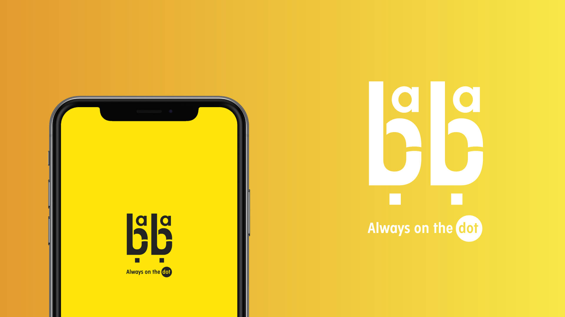
Baba Delivery seeks to save clients’ time and make its services intuitive and effortless. Hence, the new visual look needed to prove the company’s expertise “Always On The DOT”
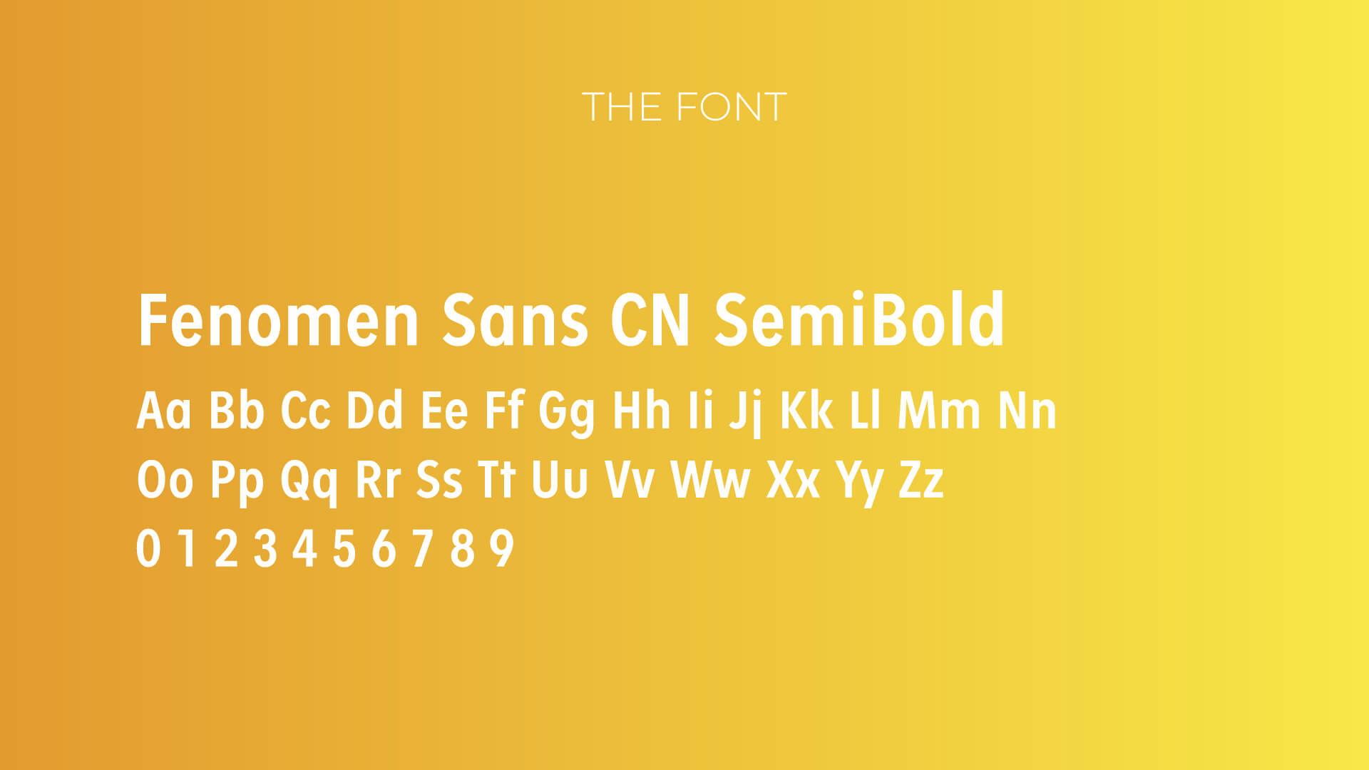
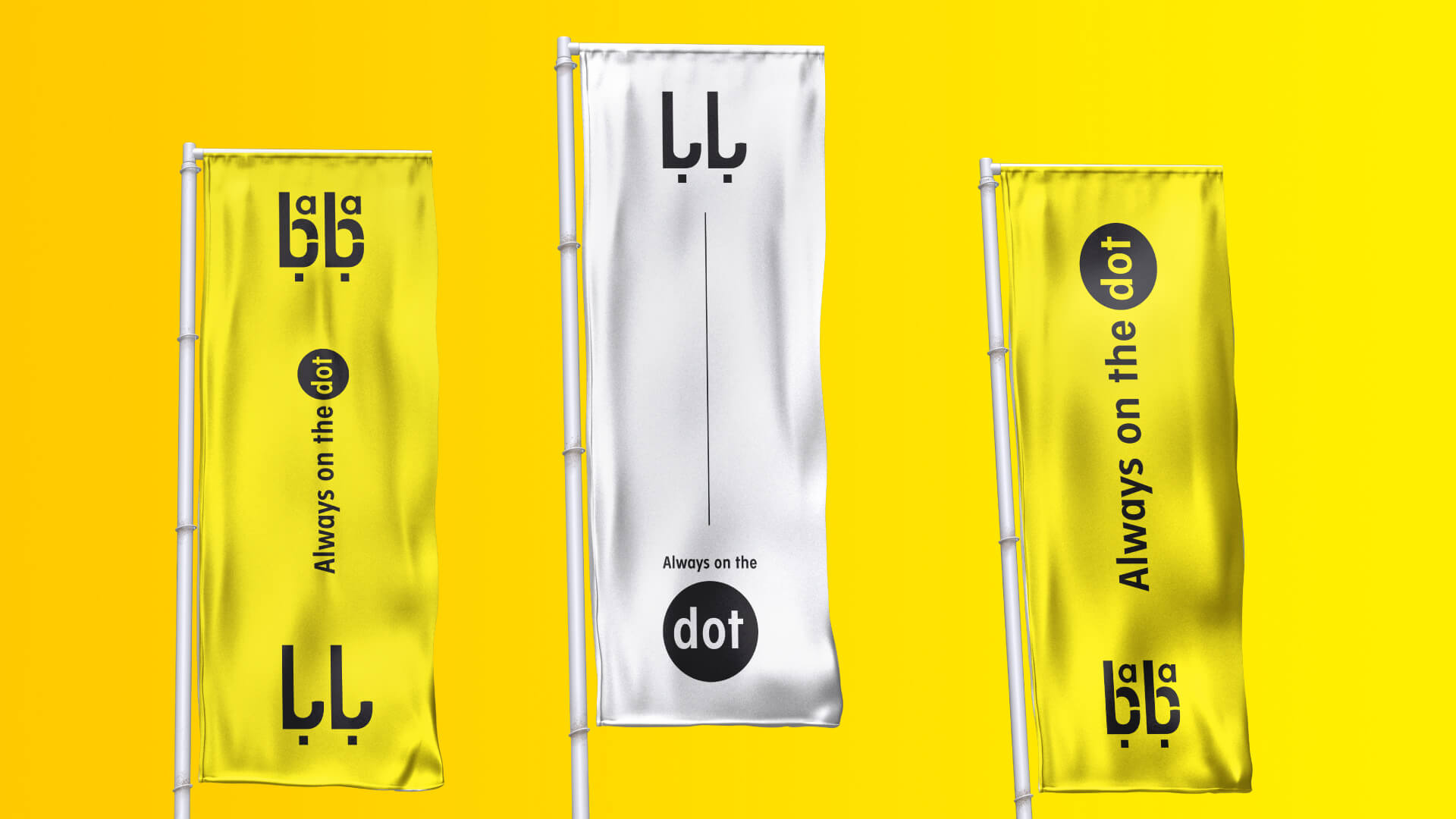
Delivery service could be described as a process of transporting products from source location to destination. Or, to put it briefly, a movement from one place to another. Therefore, it also resonates with Baba’s aim to represent the punctuality and on the dot. As a result we created BABA typeface in English adapted in Arabic as well. The Dot below on the Slogan represents accurate delivery and punctual services.
LOCATION
Kingdom of Saudi Arabia
SCOPE OF WORK
- Brand identity and Logo
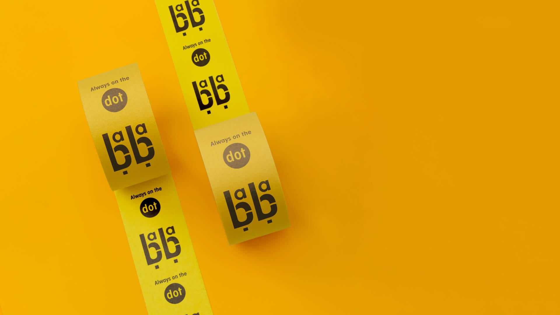
- Brand Stationeries
- Uniform Designs
- Vehicle Branding

